
Summary
- What is a landing page?
- Create a landing page
- Edit a landing page
- Duplicate a landing page
- Unpublish a landing page
- Archive a landing page
- Delete a landing page
- Restore an archived landing page
- Additional settings
- Custom domain for your landing page
- Preview Your Landing page
- Pricing & Packaging
- Granting or removing access for a shared account
- Landing Page Statistics
What is a landing page?
A landing page is a standalone web page specifically designed to receive and convert visitors into potential leads or customers. It is created with a focused objective, such as promoting a product, service, or special offer, and typically has a clear call to action (CTA) that encourages visitors to take a specific action, such as making a purchase, signing up for a newsletter, or filling out a form.
In the world of digital marketing, landing pages play a crucial role in capturing the attention of potential leads and turning them into valued customers.
Landing pages are often used in digital marketing campaigns and serve as entry points for visitors who click on a specific advertisement, email link, or search engine result. They are designed to provide relevant and compelling information to the visitor, emphasizing the key benefits or features of the offering and guiding them toward the desired conversion.
By creating well-designed landing pages with compelling copy, strong CTAs, and optimization techniques, you can effectively capture the attention of your target audience and increase conversions, contributing to the success of your marketing campaigns.
Create a landing page
Creating your landing page is a breeze with our online builder. Navigate to the Landing Pages section and click the 'Create a New Page' button.
Choose a template from our gallery.
Craft your landing page effortlessly with Mailjet’s Editor.
Once your design is complete, simply click 'Save & Publish'.
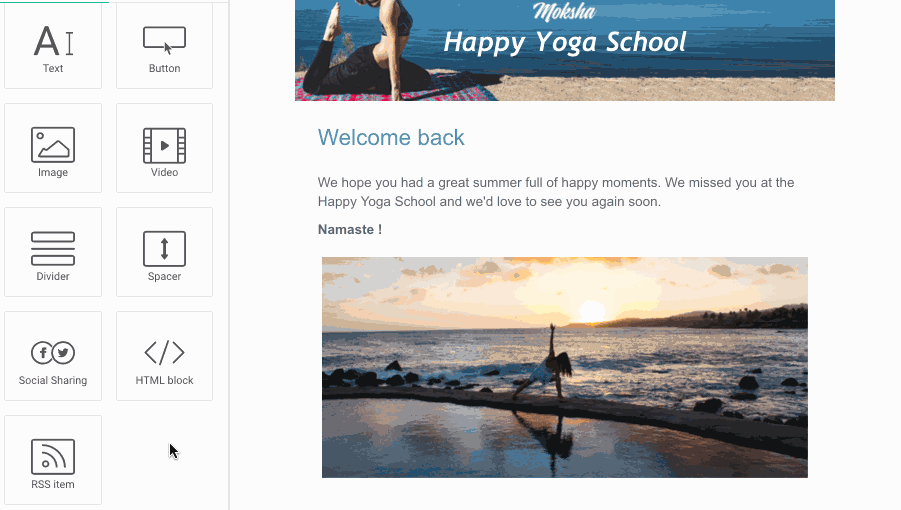
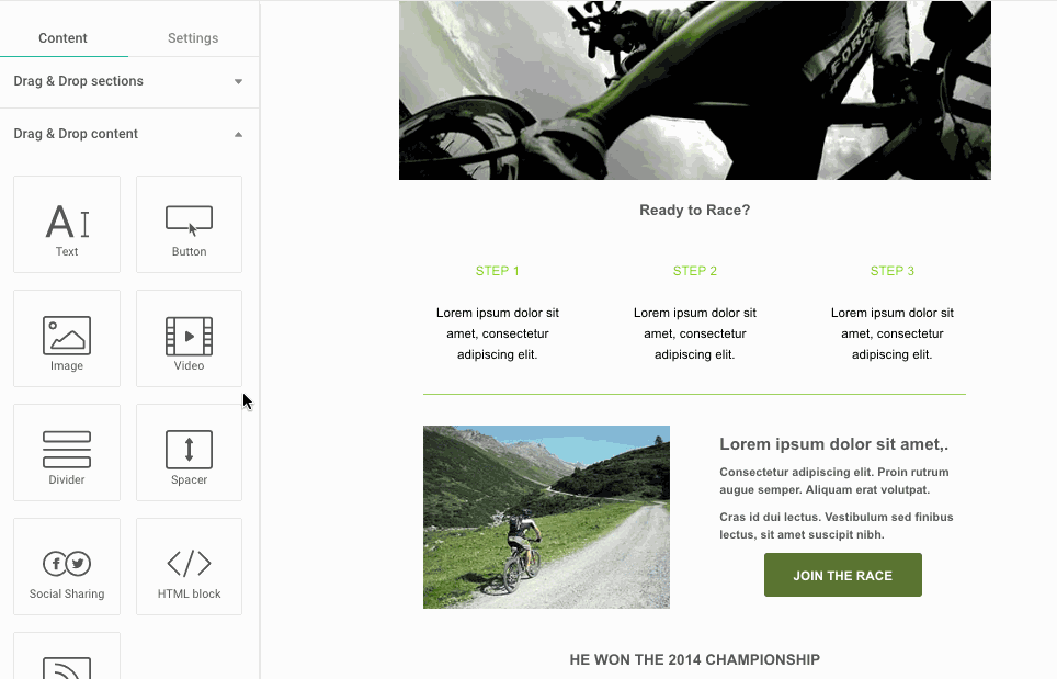
Content Tools
This area covers all the content elements that will appear in your message (text, images, buttons, social sharing, etc).
Adding content is easy - just drag the content block to the desired area on your Landing page. If you want to move that block, just drag and drop it to the new location.
Text
Using the Text toolbar, you can easily format and customize your text block:
o Adjust line heights
o Align text
o Set the background color
o Change Margins
o Personalize your content using contact properties
o Format your text (font, bold, italic, etc)
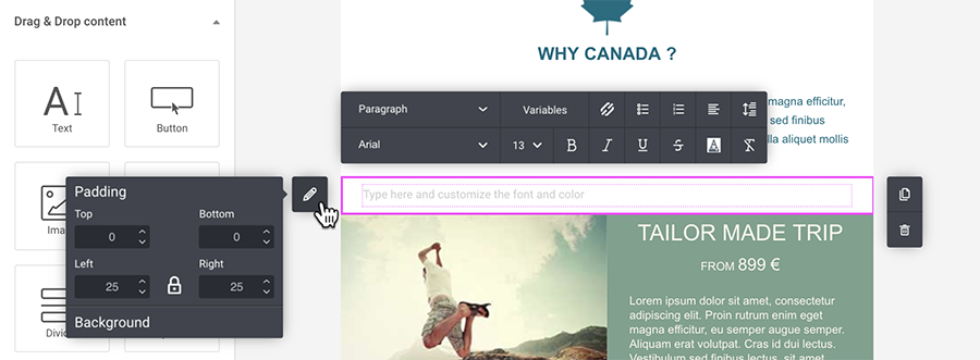
Image / Image Gallery
The Image toolbar offers a range of options to enhance your visuals:
-
- Adjust horizontal positioning
- Add padding for a polished look
- Apply a border or shape to the image
- Optimize for mobile scaling
- Set a background color for seamless integration
You can incorporate an image into your section using the following methods:
- Upload: Select an image from your device and effortlessly add it to your Image Gallery.
- Image Gallery: Choose from your existing collection of images stored in the Image Gallery for quick selection and use.
- Link: Directly use an existing image available online.
The Image Gallery feature in Mailjet serves as a centralized hub for managing and organizing images. For more details, please check the following article.
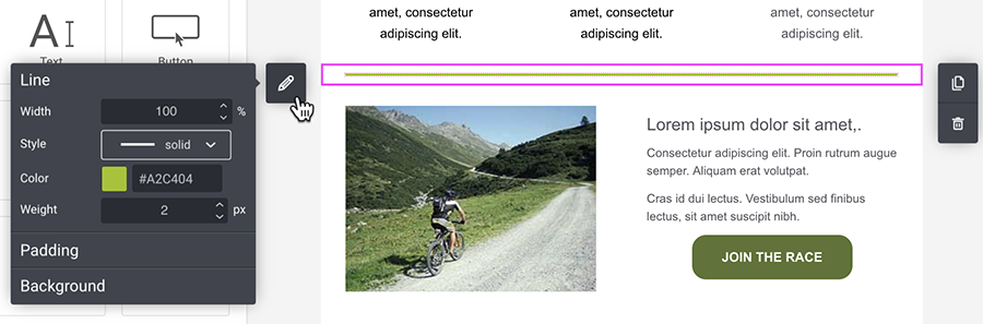
Divider
You can add a dividing line to separate sections or elements within a section (as per the example below).
The Divider toolbar allows you to:
o Set the background color
o Change Margins
o Format the line (design, color, weight)
o Adjust the horizontal and vertical spacing
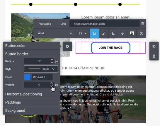
Button
There are many options available in the Button toolbar including:
o Border Radius (set the roundness of the button corners)
o Button border color, weight, and style (solid, dotted, dashed, etc)
o Set horizontal positioning and padding
o Add a hyperlink
o Font alignment
o Adjust the margins
o Personalize the text using contact properties
o Format the font (font family, color, bold, etc).
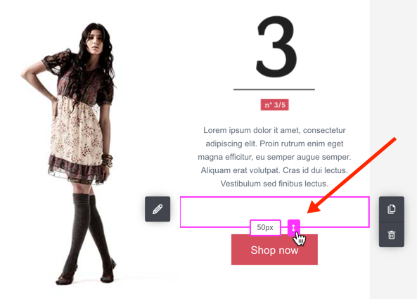
Spacer
Add a blank space to separate elements or sections within your Landing page. With the Spacer Tool, you can:
o Set the height of the blank space (in pixels)
o Add a background color (optional)
Social Sharing
Add your favorite social icons to your Landing page such as Facebook, X (Twitter), LinkedIn, Instagram, YouTube, Medium and Xing.
Click the 'Configure links' button to open the Social Media Configuration modal where you can:
• Select up to 10 social media icons
• Modify the label text
• Share your social media page.
• Create your own social icon by clicking 'Add custom icon'
To show and configure the text labels, click 'Display labels'.
Click the block options (pencil) to configure the icon size, shapes, margin, and color as well as the section background color and padding.
Share online version
Share the online version of your landing page on your social media accounts.
Click the block options (pencil) to configure the icon size, shapes, margin, and color as well as the section background color and padding.
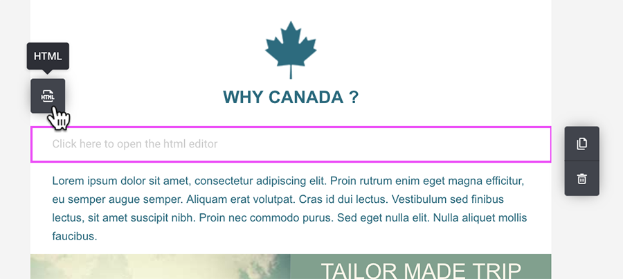
HTML Block
You can add some HTML code directly to your Landing page. Drag the HTML Block, then click on the button from the toolbar to open the HTML editor window and code away!
RSS Feed
Pull blog posts and other dynamic content into your Landing pages with an RSS Feed.
Simply drag the RSS Feed tool and add your RSS Feed URL link in the modal window. Then select the items you want imported by clicking on the drop-down list or searching by author or title.
Each imported item will appear as a section on your Landing page where you can edit the content and image as normal.
The RSS content is retrieved only once upon import and will not be updated automatically. If you need to update your RSS content, just create a new RSS feed and delete the old one.
Every time you add a URL link to an RSS Feed, it will be stored locally at API Key level. The next time you add an RSS Feed content block, you will have access to the last 5 feeds added.
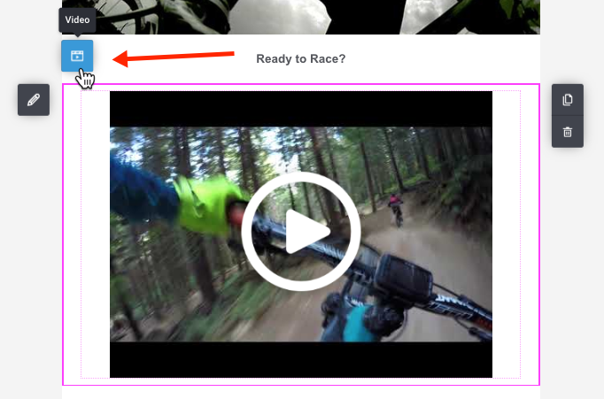
Video
To add a video to your Landing page, drag the Video tool to the desired location. In the popup modal, add your video URL.
Preview images are automatically generated for YouTube, Vimeo and Dailymotion videos. For all other videos, click ‘Choose image’ to add your own preview image.
Once the preview thumbnail is created, the default play button will be added. You can choose from several designs for the play button.
The last step is to add a simple description of the preview image in the ‘Image Alt Text’ field. This alt text will be displayed in the event your subscriber cannot view the image. Then click ‘Save Video’.
From the Video toolbar, click the ‘Video’ button to edit your video at any time.
Form
Enhance your landing page by incorporating a subscription form, allowing users to seamlessly subscribe and receive updates, newsletters, or pertinent content from your website, service, or business.
Countdown Timer
Use the Countdown Timer block to add a real-time countdown to your emails — perfect for limited-time promotions, product launches, or event reminders. The timer is rendered as an image to ensure consistent display across all email clients. Once it reaches the specified end time, it will automatically stop and display 00:00:00:00.
To insert a countdown timer, open the Content panel and drag the Countdown Timer block into your template.
Configuration Options
End date and timezone
Set the exact date and time for when the countdown should reach zero. You can also select a specific timezone from the dropdown menu.
- The default timezone is based on your account settings.
- The dropdown includes commonly used timezones such as UTC, EST, PST, and more.
Digit display settings
Customize the appearance of your countdown timer digits using the following options:
-
Show/hide individual units
Choose which time units to display: days, hours, minutes, and seconds. -
Leading zeroes
Enable or disable leading zeroes (e.g.,04vs4). -
Digit spacing
Adjust the spacing between each time unit block (e.g., 10px). -
Digit separator
Select how the units are separated:- None (default)
-
Colon
: -
Hyphen
- -
Pipe
|
-
Digit color
Define the font color for the countdown numbers using a hex value or the color picker. -
Font family
The timer supports only web-safe fonts to ensure maximum compatibility. The dropdown includes fonts like:- Arial
- Verdana
- Tahoma
- Georgia
- Helvetica
- Times New Roman
-
Background color
Set the background color behind each digit block to improve readability and match your design style.
Timer labels
Toggle whether unit labels (e.g., Days, Hours, Minutes, Seconds) are shown below the digits.
- Default: Labels are shown
- You can also customize:
- Change the font style using the dropdown menu (web-safe fonts only)
- Label color
Expiration Display
When using the Countdown Timer block in a Landing Page, you’ll have access to an additional setting: Expiration Display. This option defines what happens when the countdown reaches zero.
Expand the Expiration Display section in the settings panel to configure this behavior.
You can choose from the following options:
-
Display expired timer (default)
The timer will remain visible, frozen at 00:00:00:00. -
Hide expired timer
The countdown block will be automatically hidden after expiration. -
Display image when expired
It replaces the countdown timer with a custom image once the timer ends, which is ideal for showing an “Offer expired” banner or similar message.
Padding and Borders
You can customize the spacing and border of your Countdown Timer block for better alignment and visual appeal.
Padding
Use the Padding settings to control the space inside the block (between the content and its edges).
You can adjust the padding individually for each side:
- Top
- Bottom
- Left
- Right
Click the 🔒 lock icon to link or unlink the values for symmetrical spacing.
Borders
In the Borders section, you can define the border weight to add an outline around the Countdown Timer.
- Set the weight to
0for no border, or increase it to add thickness.
These options help you fine-tune spacing and layout for a polished design.
Carousel
Use the Carousel block to display several pieces of content in a single, swipeable area of your landing page. It’s ideal for things like customer reviews or product highlights.
Add a Carousel block
In the editor, from the Content tools panel, drag the Carousel block into the section where you want the slider to appear.
A default carousel with several slides (3 default) is added to your page. Click inside the block to start editing.
Manage slides
Each carousel is made up of individual slides:
-
Use the toolbar at the top of the block to:
Reorder slides – open an overview to change the slide order.
ADD a slide.
Duplicate a slide.
Delete the current slide.
Manage the Image for the slide.
Adjust displayed (for example, Cover).
Click the left/right arrows inside the block to move between slides while editing.
Edit the content of each slide (titles, text, buttons, images, etc.) just like any other section on your landing page.
Customize the carousel design and behavior
When the Carousel block is selected, use the panel on the left to customize its layout, appearance, and animations. The configuration options are grouped into several categories:
Carousel settings – Define the overall layout of the carousel.
Adjust the aspect ratio (for example, 16:9), choose whether to display slide indicators, and select an indicator type (dots or lines).Arrow components – Customize the navigation arrows.
Enable or disable arrows, choose different icon styles, adjust size and weight, set the arrow color and opacity, and optionally display a background behind the arrow icons. You can also choose the arrow shape.Transition and animation – Control how slides move.
Choose a transition effect, set the animation speed, enable autoplay, define the delay between slides, and decide whether the carousel should loop or pause on hover.Padding – Adjust the internal spacing around the carousel.
Set independent values for top, bottom, left, and right padding.Background – Choose whether the carousel has a transparent background or a solid color.
Use the Desktop / Mobile preview toggles in the top-right corner of the editor to make sure the carousel looks good on all devices before you click Save & Publish.
Accordion
Accordion block lets you organize and display your content in a structured and interactive way. It’s perfect for FAQs, detailed product info, or any section where you want visitors to expand and collapse content for a cleaner layout.
Add an Accordion Block
Drag the Accordion block into the desired section of your landing page.
By default, the accordion will contain three panels, each with:
A panel heading (title area)
A panel body (content area)
Configure your accordion blocks
👉 Panel Settings
Click anywhere inside the accordion, select its parent container, and click the pencil icon ✏️ on the top border to open the Accordion settings panel. The Panel settings section controls how your accordion behaves by default and how visitors can interact with it.
You can:
Change the number of panels using the number selector or the up/down buttons.
-
Decide which panels are open when the page loads, choosing between:
All panels open
All panels closed (collapsed)
First panel open
Allow multiple panels to be expanded at the same time, or restrict users to one open section at once.
Collapse panels automatically when the user clicks outside the accordion.
Add smooth animations for a subtle expand/collapse effect.
👉 Icon Settings
You can customize the look and position of the icons that appear next to each panel heading.
Here, you can:
Turn icons on or off.
Choose different icons for the expanded and collapsed states (for example, + / − or arrows).
Pick a style — either Sharp or Rounded.
Adjust the size and weight of the icons to fit your design.
Position icons on the left or right side of the heading.
Change the icon color using a HEX code or color picker.
👉 Borders and Dividers
You can add or customize borders to separate your panels visually.
The Borders section lets you:
Turn borders on or off for each panel.
Choose the thickness, style (solid, dashed, dotted, or double), and color of your border.
Add dividers between panels for better visual separation.
👉 Margins
Margins define the space around your accordion and between individual panels.
You can:
Adjust the top, bottom, left, and right margins in pixels.
Use the lock icon to apply the same margin to all sides or unlock it to adjust each side individually.
Control the space between panels for a more compact or open layout.
👉 Padding
Padding controls the space inside your accordion panels — between the border and the content.
You can modify the padding for two areas:
The Heading (around the title and icon).
The Body (around the content inside each panel).
Adjust the top, bottom, left, and right values individually or keep them locked to apply uniform spacing.
👉 Color Settings
You can set custom text and background colors for both the header and the body areas.
For the Panel heading, you can:
Keep the background transparent, or choose a solid color.
Set the text color for your title.
For the Panel body, you can:
Use a transparent background or select a color.
Set the text color for the content inside the panel.
👉 Background
Finally, you can define the accordion’s overall background.
Choose between:
Transparent, to let the accordion inherit the section’s background.
Color, to apply a solid background to the entire accordion block.
Accessibility
The accordion is fully keyboard-navigable.
Visitors can use arrow keys to move between panels and expand or collapse sections without a mouse, ensuring accessibility compliance.
Brand Kit Logo Component
We’ve added a new "Logo" component to the email builder, making it even easier to integrate your logo into your templates.
Key Features:
-
If you have a Brand Kit with a saved logo, a Logo component with a preview of your logo will appear in your builder.
- Simply drag and drop the logo into your template.
- The logo behaves similarly to an image block but:
- It’s centered by default.
- It doesn’t have the standard image toolbar, simplifying its behavior.
- It will automatically adjust to the background color:
- Light background → light logo variant.
- Dark background → dark logo variant.
- Logo Redirect URL (if set in the Brand Kit) will automatically be applied to the logo.
Behavior When No Logo Is Available:
- If your Brand Kit doesn’t have a logo, the Logo component will be hidden in the builder.
- If a logo is deleted from the Brand Kit, the Logo component will no longer appear.
Managing Existing Templates:
- Logos already placed in templates will not be removed, even if you update or delete logos from your Brand Kit.
- If you replace a logo in the Brand Kit, previously created templates will retain the old logo.
- If you duplicate a template, the logo will be preserved in the duplicated version.
- If you delete a logo and later upload a new one, you must manually reinsert the new logo into your templates.
Sections
Add a Section to Your Landing page
You can build your Landing page by adding sections. Then you add different elements (text, buttons, images, …) to each section. A section can have 1, 2, 3, 4, 5 or 6* columns, with varying widths.
* Columns 1 to 4 can be accessed from the sections menu. To add two more columns (5 and 6), you can do so directly within the section itself under the pen button (section settings). Within this menu, you also have the flexibility to change the number of columns on the fly to better suit your design.
To access the sections menu, click on the 'Window' icon in the upper left corner ("Layout" tab).
Drag and drop the section layout you want into your Landing page.
To add two more columns beyond the initial four, or modify the existing number, click on the section background. Select the 'pen' icon on the left, navigate to the columns section, and choose the desired number (up to 6).
Move a Section
Click in the section background then on the up or down arrows.
Duplicate a Section
Click within the section to highlight it, then click the duplicate icon on the right side of the screen.
Delete a Section
To remove a section, click within the section, then click the trash icon and confirm the deletion.
You can also quickly delete a section or element, by dragging it to the content tools area.
Global Style Settings
With a couple of clicks, easily format the text styles of all your paragraphs, headers and hyperlinks within your Landing page.
To access the global text styles, click on the gear icon in the upper left corner ("Settings" tab).
As the name suggests, the "Global Style" option will set the font family and color for all the elements listed (Headers, Paragraphs, Links).
You can then further customize the styling for each of the Headers, Paragraph and Link elements.
Lastly, if you want to have a different text style for a certain header or paragraph in your form, simply style the text as usual with the section toolbar.
Edit a landing page
From the landing pages management page, click on the gear icon, and select 'Edit'. This will grant you the ability to tailor your landing page to align with your latest objectives before publishing it once again.
Duplicate a landing page
To duplicate a landing page, simply click on the gear icon from the landing pages management page and select 'Duplicate'.
Unpublish a landing page
To unpublish a landing page, just click on the gear icon located on the landing pages management page and choose 'Unpublish'. This action will efficiently remove the page from being publicly accessible while retaining it within your management options.
Archive a landing page
To archive a landing page, click on the gear icon on the landing pages management page and select 'Archive'. This process will neatly store the page, making it temporarily inaccessible while preserving it within your management tools.
Delete a landing page
You can delete a landing page from two locations:
- On the landing pages management page, click on the gear icon and choose 'Delete'.
- If the landing page has been archived, go to your archived pages, then click the gear icon and select 'Delete'.
Restore an archived landing page
To restore an archived landing page, navigate to your archived pages, then click on the gear icon and select 'Restore'.
Additional settings
On the settings page, you can modify the name and URL of your landing page, implement search engine and social media optimizations. Additionally, you have the opportunity to personalize the favicon (the small icon next to the page title in the browser tab) of your page.
Custom domain for your landing page
Benefits of using a custom domain for a landing page
Using a custom domain for a landing page offers several significant benefits, particularly in terms of branding, credibility, and Search Engine Optimization (SEO).
-
Branding
A custom domain presents a professional image, making your site easier for visitors to remember and recognize. It also reinforces consistent branding across all marketing materials.
-
Credibility and Trust
A custom domain increases visitor trust and perceived legitimacy, signaling that you are serious about your business.
-
Search Engine Optimization (SEO)
Custom domains are favored by search engines, improving site ranking and allowing for keyword optimization within the domain name.
By default, any landing page you create is hosted by Mailjet. However, we recommend hosting your landing pages on a custom domain if you have one.
Creating a subdomain for your landing page
If you already have a website on a custom domain, you will need to create a subdomain for your landing page. For instance, if you own yourdomain.com and your existing website lives there, host your landing pages on a subdomain, such as pages.yourdomain.com.
This is mandatory cause using your custom domain for Mailjet landing pages requires changing the DNS records for that domain. If you make these DNS changes directly on yourdomain.com, your landing page will replace your existing website, which is not desired.
Adding your subdomain to your landing page
To add your subdomain to your landing page, start by navigating to the Account Information page and selecting "Set up a page domain" under the Senders and Domains section.
Next, click "Add a Page Domain" and enter the required information: Label, Subdomain, and Domain.
Once you have filled in these details, click "Add" to complete the process.
After adding your subdomain, you need to create a CNAME record in the DNS zone of your subdomain. This must be done through your domain host, and the process varies depending on the host.
Finally, click "Check DNS" to update the status after adding the record. If the status turns green, you're all set!
Activating your custom domain on your landing page
To activate your newly added subdomain for your landing page, navigate to your landing page settings.
Under the "Page URL" section, select the custom subdomain from the dropdown menu.
Click "Save". Congratulations! Your landing page will now use your custom domain!
Preview Your Landing page
In the Landing page editor, you'll find two preview options (Desktop & Mobile) available in the upper right corner. The Desktop version is displayed as the default and represents the draft template you're currently working on, while the Mobile option allows you to preview the display on mobile devices.
Pricing & Packaging
Free and Essential plans allow you to build a landing page, but publishing is not available. To unlock publishing capabilities, you will be prompted to upgrade your plan. Once you upgrade to Premium or Custom, you will have landing pages at your disposal.
However, it's important to note that if you decide to downgrade your plan, you will lose access to your landing pages, resulting in them becoming inactive.
- If you downgrade to Essential, we will retain your landing page data for a period of 400 days. This allows you to reactivate your landing pages within a reasonable timeframe, should you choose to upgrade your plan again.
- In the case of a downgrade to Free, we will keep your landing page data for a period of 90 days. This grace period provides you with an opportunity to reconsider your plan choice or potentially upgrade to regain access to your landing pages.
Granting or removing access to a shared account
If you plan to grant or remove access to this feature to a shared account, you can do so from the account sharing page.
Simply click on “Manage → Edit”.
Then check or uncheck the Landing pages box and update the access.
Landing Page Statistics
Once your landing page is published and starts receiving traffic, you can monitor its performance directly in your Mailjet account. The Landing Page Statistics feature offers insights into visitor activity, engagement, and campaign effectiveness.
How to Access Landing Page Stats
- Go to the Pages tab from the left-hand navigation menu.
- Click the Settings (⚙️) icon on the landing page you want to analyze.
- Select View statistics from the dropdown menu.
Overview Section
At the top of the page, you’ll find a quick summary:
- Status (Published or Draft)
- Created date
- Modified date
- Total visits: Number of times the landing page was loaded
- Total clicks: Number of link clicks on the landing page
- Included form(s) (if any)
Visitors & Engagement
The Visitors & Engagement chart provides a visual breakdown of:
- Visits and clicks over time
- Activity across the selected date range
- Total signups (form submissions)
Unique Visitors
This section shows how many individual users visited the page, based on their IP addresses.
Campaign Attribution
If your landing page is linked to an email campaign, the Data from Campaign(s) section will display:
- The email address of the recipient
- The campaign subject line
- The date of their visit
Only the first 100 contacts are displayed. To view the full list, click the "Download all as CSV" button to export the data.
Device and Location Breakdown
Understand your audience better with data on:
- Device type (e.g., Desktop, Mobile)
- Top locations by country